BootStrap으로 반응형 디자인을 만들어 보자
BreakPoint
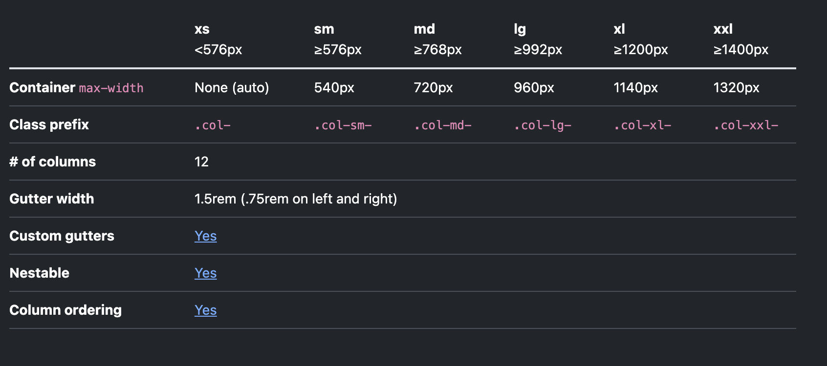
Row 태그 안의 Col 태그에 breakpoint별 비율을 아래와 같이 지정할 수 있다.
1
2
3
4
5
6
7
8
9
10
11
12
13
14
15
16
17
18
19
function ResponsiveAutoExample() {
    return (
        <Container>
            <Row>
                <Col className='bg-yellow-300' xs={8} lg={3}>
                    CONTENT
                </Col>
                <Col className='bg-red-300' xs={4} lg={9}>
                    CONTENT
                </Col>
            </Row>
            <Row>
                <Col sm> sm=true</Col>
                <Col sm> sm=true</Col>
                <Col sm> sm=true</Col>
            </Row>
        </Container>
	);
}
- xs 화면(576픽셀보다 작은 경우) 8:4의 비율로 Col 태그를 구성하라 [비율의 총 합은 12]
- lg 화면(992픽셀보다 큰 경우) 3:9의 비율로 Col 태그를 구성하라 [비율의 총 합은 12]
Row 태그에 Col 태그가 한줄에 몇개씩 출력될것인가를 정할 수 있다.
1
2
3
4
5
6
7
8
9
10
11
12
13
14
15
16
17
18
<Row xs={1} md={2} lg={3} xl={4} xxl={4} className="g-4 mt-3 pl-5 pr-5">
  {Array.from({length: 8}).map((_, idx) => (
      <Col key={idx}>
          <Card style=>
              <Card.Img variant="top" src="sample.url"/>
              <Card.Body style=>
                  <Card.Title>Card Title</Card.Title>
                  <Card.Text>
                      Some quick example text to build on the card title and make up the
                      bulk of the card's content.
                  </Card.Text>
                  <Button variant="primary">Go somewhere</Button>
              </Card.Body>
          </Card>
      </Col>
  ))}
</Row>
- xs 화면의 경우 Row안에 Col태그를 한줄에 1개 배치하라
- md 화면의 경우 Row태그 안에 Col태그를 한줄에 2개 배치하라
- lg 화면의 경우 Row태그 안에 Col태그를 한줄에 3개 배치하라
- xl 화면의 경우 Row태그 안에 Col태그를 한줄에 4개 배치하라
- xxl 화면의 경우 Row태그 안에 Col태그를 한줄에 4개 배치하라
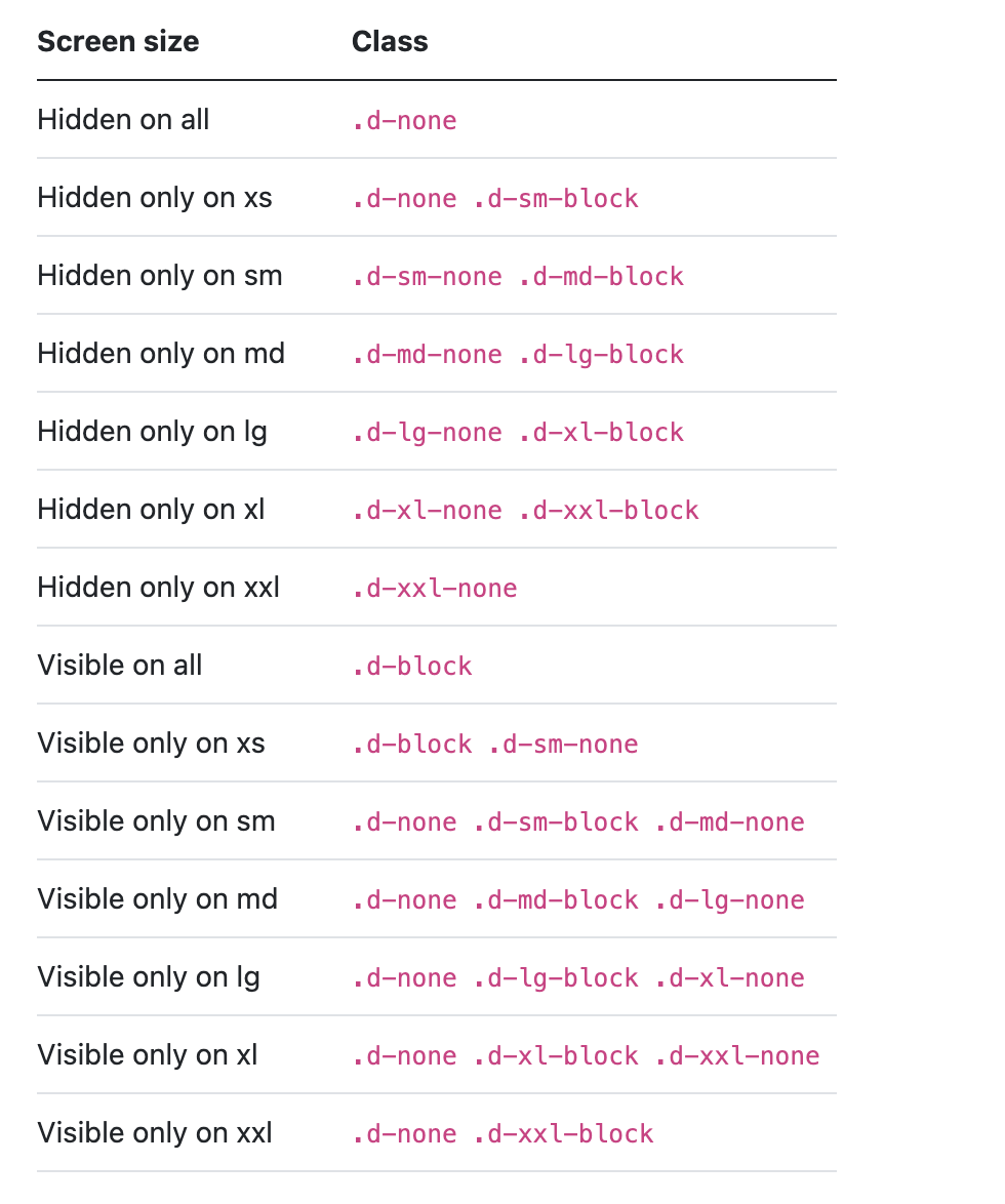
아래의 class 를 활용해서 특정 breakPoint의 내용을 출력 또는 숨김처리하기
This post is licensed under CC BY 4.0 by the author.